Thursday, 18 October 2012

Final Submission

Introduction
The style of architecture has been change over the years because of what influences architects that help inspire them towards their design. I designed a very modernized  Museum using inspiration from my two selected buildings. My influences for my design was art in architecture which technically architecture is a form of art in itself. The two buildings that influenced my design were the 'venoms lair' and the sun tower in korea. The venoms lair having its very abstract facade being inspired to look like shell which gave me to idea to have a similar feature. The Sun tower was influenced by origami which i has affected the form of my blue tinted barrier.

The two concepts for my design were 'Materiality' and 'abstract'. Materiality was tough to show in a design perspective, i used strong materials such as onyx and steel to show fortitude towards my idea of big open out  door spaces. The way i conveyed the concept abstract was through the barrier, i wanted the glass to reflect the building to give the impression of the painting 'relativity' made by MC Escher where when looking at it internally give the impression of a abstract world thus naming the building 'Azure Relativity"

A1 Posters


Animation

Renders


Visualisation


Reflection on Assignment 3
Ignoring the problems i had trying to export my 3ds model to crysis i am quite pleased with my end result. My idea of the barrier came out more than i hoped it would which in my opinion is my main feature to my entire design. This assignment has pushed my capabilities with 3d studio max and i am now comfortable using the program which originally i wasn't.

MediaFire Link
http://www.mediafire.com/?183r318sl5467wk


Week 11 - Material Montage, PDF Draft, Post-Production

Material Montage

Post-Production Internal Shots


Week 10 - Draft Model

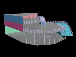
Draft Model Progression

The museum will consist of 3 levels, the ground level being the main gallery having large open spaces. the first floor will be the is both enclosed and open having sculptures and other pieces in the open area and paintings inclosed.


Note the stairs are completly wrong according to aus standard.


The barrier for some unknown reason could not render completly leaving it black.
The barrier glass is going to be tinted blue when i render it in vray.
I used metal ray as a test render but i will be using vray for my renders in the final submission.

Thursday, 20 September 2012

Week 9 - Design Sketches and Model

Design Sketches
The museum will be on the first two levels and the art school will be on the top two levels. i tried experimenting with the glass panels whether to use irregular panels or the traditional panels in my design.
NOTE: this is not the final concept design, this is only a basic layout for the function of the building, i will be experimenting with the form more in depth when i model it in 3ds.


I wanted to encase/wrap my building in a shell which also acts a rain/sun barrier. The blue outing shows the framing of the barrier.

I filled in the framing with light blue and turned down the transparency because i didnt want the barrier to completely hide the building, with this being said the barrier will transparent enough to see the building.

Experimenting with different shapes of the barrier, the barrier will look alot like the venom's lair facade having irregular angles and folds. 

Week 8 - Precedent Study and Design Proposal

Proposal Brief Outline
For my assignment 1 i had chosen Morphosis as my architect/firm and for assignment i selected the Hypo Alpe-Adria Bank and for this assignment i wanted to select a similar building within the firm. The themes that i wanted to explore for this assignment were materiality and abstract, i wanted both selected buildings to have these themes in their design concept and also my assignment.

 i selected the Sun Tower which was built in korea. Both buildings had a similar material finish shown in the envelopes of the building being mainly glass and steel that appears to be translucent and how both used large steel awnings offsetting from the buildings. The building shape was inspired by origami giving its abstract shape as if the building was folding.


The buildings functions as retail and office spaces being the lower levels retail and above levels office. i wanted the function of my design to have a connection with my themes so i decide choose a museum as the main function for my design, i also wanted to incorporate a space for learning for art students. (will have to discuss with tutor).

A Visual Analysis of 2 Precendent Studies As A Pair


Materiality
The second building i selected was the Basque Health Department or commonly known as the 'Venoms Lair", designed by Coll-Barreu Arquitectos this building perfectly shows the themes i wanted to show in my concept design. The building uses large dark tinted glass panels and jet black steel frames.

Abstract
Both buildings were designed based on a physical object, the sun towers shape was inspired by origami having the building looking like it is folding and transforming. The Venoms lair was inspired by a shell, to me the building looks like if you were to wrap and piece of paper around a shell given the effect of irregular angles.

Prescribed Additional Representation

Thursday, 23 August 2012